Craig Maxey Portfolio
46 Shore Drive
Concord, MA 01742
978-760-0584
cmm@wpdesign.com
Red Boat Care
Stealth Mode Startup.
Our goal at Red Boat Care is to improve patient outcomes through better medication/therapy adherence. To achieve that goal we are building a tool for the frontlines of healthcare, patients and their caregiver teams. We leverage our expertise in healthcare services and product design to build a tool that is needed and creates value.
White Pond Design
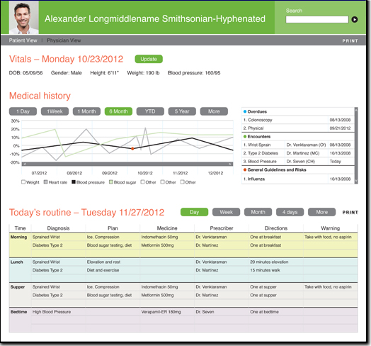
Patient Health Record Redesign - Patient View
(Health Design Challenge).
White Pond Design interaction design that provides both patient and physician views into the health information captured in the Patient Health Record. Our interaction design leverages the value in being able to observe and interact with patient data over time. We are currently using this design to elicit feedback from patient and physician users.
White Pond Design
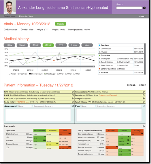
Patient Health Record Redesign - Physician View
(Health Design Challenge).
White Pond Design interaction design that provides both patient and physician views into the health information captured in the Patient Health Record. Our interaction design leverages the value in being able to observe and interact with patient data over time. We are currently using this design to elicit feedback from patient and physician users.
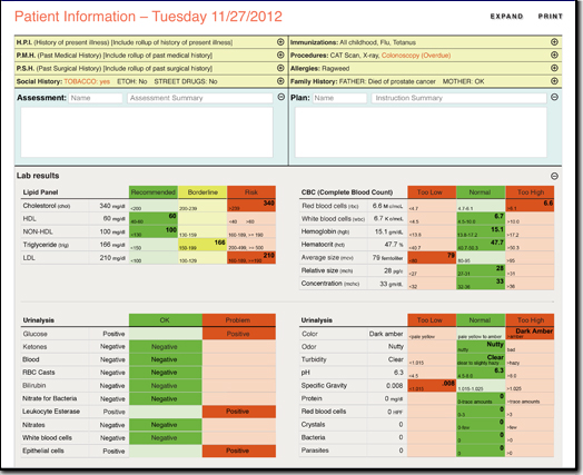
White Pond Design
Patient Health Record Redesign - Physician View
(Health Design Challenge).
White Pond Design interaction design that provides both patient and physician views into the health information captured in the Patient Health Record. Our interaction design leverages the value in being able to observe and interact with patient data over time. We are currently using this design to elicit feedback from patient and physician users.
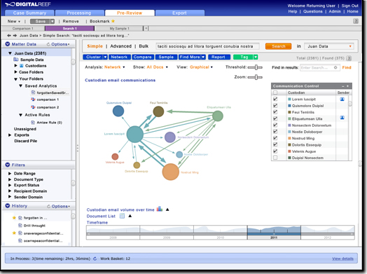
Digital Reef
E-Discovery Software.
An object-oriented interaction design that restored customer confidence. Highly interactive information retrieval and analysis designs that took full advantage of Silverlight technology.
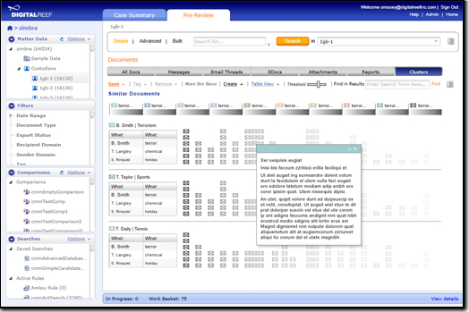
Digital Reef
E-Discovery Software.
An object-oriented interaction design that restored customer confidence. Highly interactive information retrieval and analysis designs that took full advantage of Silverlight technology.
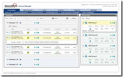
SoundBite
Proactive Communications Platform.
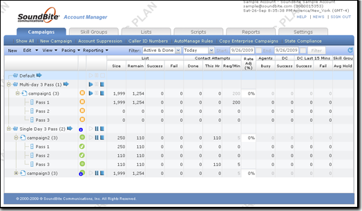
A GWT framework based application that supports the real time monitoring and management of communication campaigns. Standard user interface heuristics, e.g. direct manipulation, proximate actions, and progressive disclosure, improved this management page replacement.
SoundBite
Proactive Communications Platform.
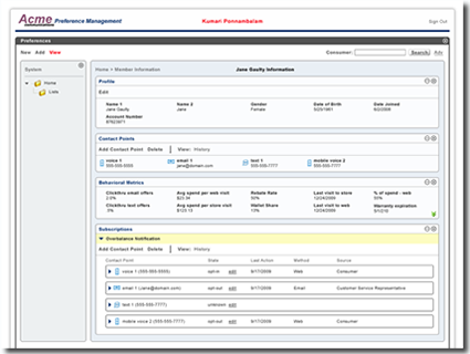
A GWT framework based application that supports the management of customer communication preferences.
SoundBite
Proactive Communications Platform.
A GWT framework based application that supports the real time monitoring and management of communication campaigns. Standard user interface heuristics, e.g. direct manipulation, proximate actions, and progressive disclosure, improved this management page replacement.
aPriori
Enterprise Manufacturing Cost Analysis Application.
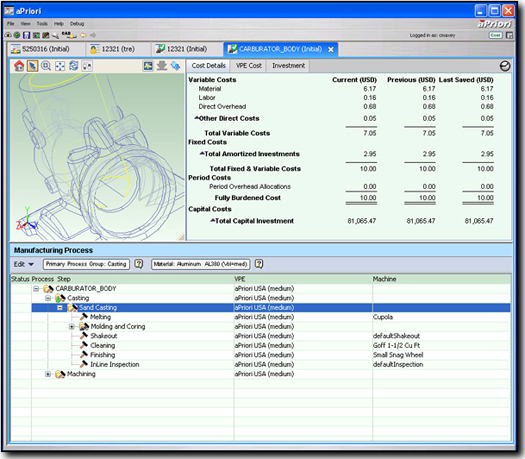
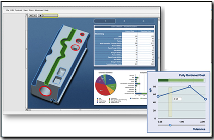
This Swing based application provides CAD designers real-time cost analysis of parts. The original single component interaction was replaced with an object oriented design that progressively disclosed cost information. My field work revealed necessary enterprise integration product requirement changes.
aPriori
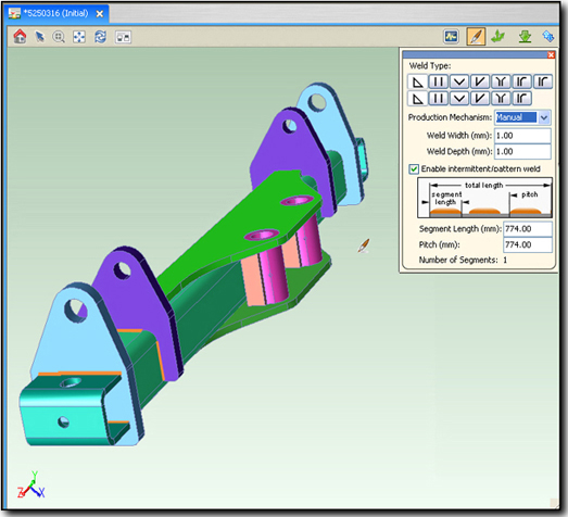
Tool based, single click, 3D geometry editor.
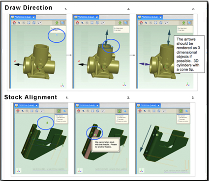
Created the graphical editing capabilities of the product. Design leaned on a single click tool approach. This required mapping user goals into the appropriate tool abstractions. The resulting interaction reduced 5 click industry approaches to a single click.
aPriori
Tool based, single click, 3D geometry editor.
Created the graphical editing capabilities of the product. Design leaned on a single click tool approach. This required mapping user goals into the appropriate tool abstractions. Implemented mouse-over single click selection of part properties.
aPriori
Reusable property editor designs.
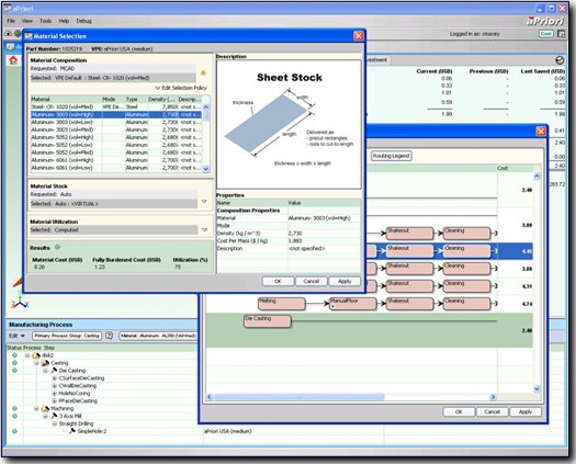
The aPriori cost management tool presented many object editing requirements. Those requirements were distilled into a single edit interaction design that enabled the user to observe the cost impact of changes while still in the edit experience. This design offered the value that comes with consistent interactions.
aPriori
'Project Allegro'.
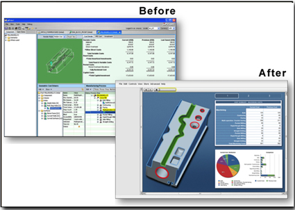
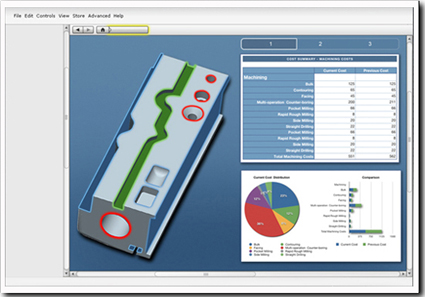
Reporting directly to the CEO, I was tasked with creating the product vision for the future. This project, Allegro, was initiated with my identifying the key product mission, "Where is the money going and why?". The resulting design leaned on a mandate that the user should be able to "squint" at the experience and know where the money is going.
Veridiem
Marketing ROI analytics.
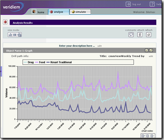
This web based enterprise application used regression models to provide marketing ROI for radio, TV, and print campaigns. Users of this product could also create simulations to predict the effect of marketing spends. The challenge with this application was presenting both charting a table data to users based on the desired information insights. The resulting interaction was deemed very friendly by the product's Fortune 500 customers.
Veridiem
Marketing ROI analytics.
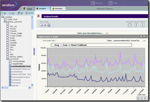
Different personas had access to different types of data, different navigation requirements, and editing capabilities. My interaction design provided a seamless interaction experience for users migrating across different persona types.
Veridiem
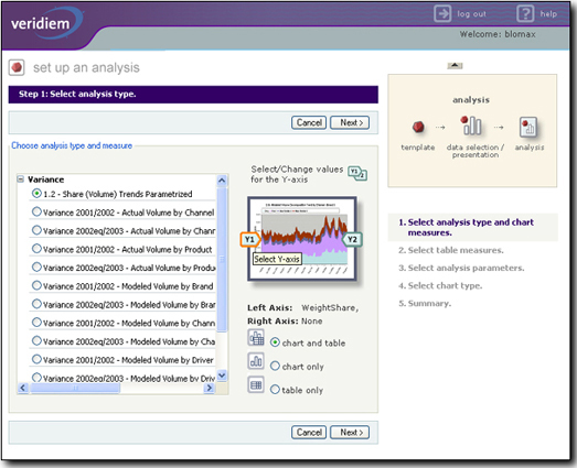
User created analysis report based on desired insights (information goals).
The creation of user specified analytics presented a unique challenge with this interaction design. Departing from standard data cube navigation approaches, my design focused on the information goals of the user. The user could create analytics driven by this goal or he could directly specify his data table/charting requirements. This novel design merged canned reporting capabilities with user defined reporting.
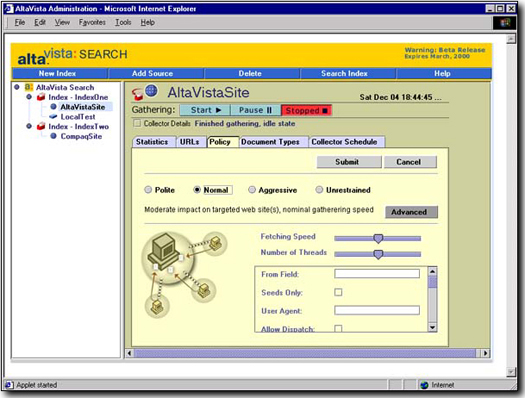
AltaVista
Enterprise search management tool.
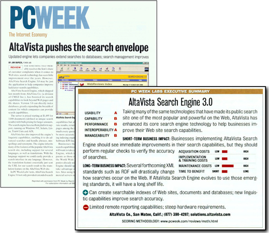
Working closely with a usability team, I created and implemented the design of this Swing based enterprise search indexing tool. The resulting user centered interaction design garnered high praise in usability from industry analysts.
